Your homepage is often the digital front door to your business. It is the first impression, the handshake, and the elevator pitch all wrapped into one. Yet, many businesses treat their homepage like a digital junk drawer, cramming in every piece of information, corporate milestone, and product feature they can think of.
When user attention spans are measured in milliseconds, a cluttered, confusing homepage is a conversion killer.
True homepage optimisation isn’t about making things look pretty; it’s about clarity, direction, and reducing the friction between a visitor arriving and taking a desired action. To help you transform your page into a high-performing conversion asset, we have broken down 10 critical, data-backed changes you can implement today.
1. Craft a Crystal-Clear Above-the-Fold Value Proposition
The space “above the fold”—the part of the screen visible before a user scrolls—is the most valuable real estate on your entire website. Within three to five seconds of landing on your page, a visitor must be able to answer three fundamental questions:
- What do you offer?
- How does it benefit me?
- What do I do next?
If your headline relies on vague corporate buzzwords (e.g., “Synergizing paradigms for ecosystem growth”), you are losing money. Instead, use a simple formula: [Target Audience] + [The Problem You Solve] + [The Ultimate Outcome]. Make your core headline bold, clear, and focused entirely on the user’s primary pain point.
2. Implement a Single, Unmissable Primary CTA
A classic mistake in homepage design is giving visitors too many choices. When you present someone with five different buttons of equal visual weight—”Learn More,” “Read Our Blog,” “Contact Us,” “See Pricing,” and “Book a Demo”—you trigger decision paralysis.
- Choose one primary action: Determine the single most important action you want a user to take (e.g., “Start Free Trial” or “Book a Strategy Call”).
- Make it pop: Use a high-contrast action color from your brand palette that stands out drastically against your background.
- Keep it sticky: Consider a sticky or floating navigation bar so that as users scroll down the page, your primary CTA remains accessible at all times.
3. Streamline Navigation to Reduce Cognitive Load
Your main menu should not look like a site map. A bloated navigation menu creates cognitive fatigue, causing visitors to bounce before they even explore your offerings.
Keep your primary navigation restricted to five or six essential items at most. Group secondary pages (like your privacy policy, careers, or press releases) into the footer. If you must use a dropdown menu, ensure it is cleanly organized and intuitive. The goal is to guide the user’s journey, not let them get lost in the weeds.
4. Leverage High-Impact Visual Proof and Micro-Testimonials
Before a consumer buys into your product or service, they need to buy into your credibility. Human beings are hardwired to look to others for validation, which is why social proof is an absolute necessity on your homepage.
Instead of hiding all your reviews on a dedicated “Testimonials” page, sprinkle them strategically throughout your homepage.
Pro-Tip: Standard text reviews can easily be fabricated. Increase trust by pairing reviews with real names, job titles, company logos, or headshots. Better yet, include video testimonials or embed verified, third-party review widgets from platforms like Trustpilot or G2.
5. Harness Behavioral Data via Heatmaps and Session Recordings
You cannot fix what you do not measure. Guessing where your users are clicking or why they are dropping off is a recipe for wasted ad spend and stagnant growth. This is where behavioral analytics tools come into play.
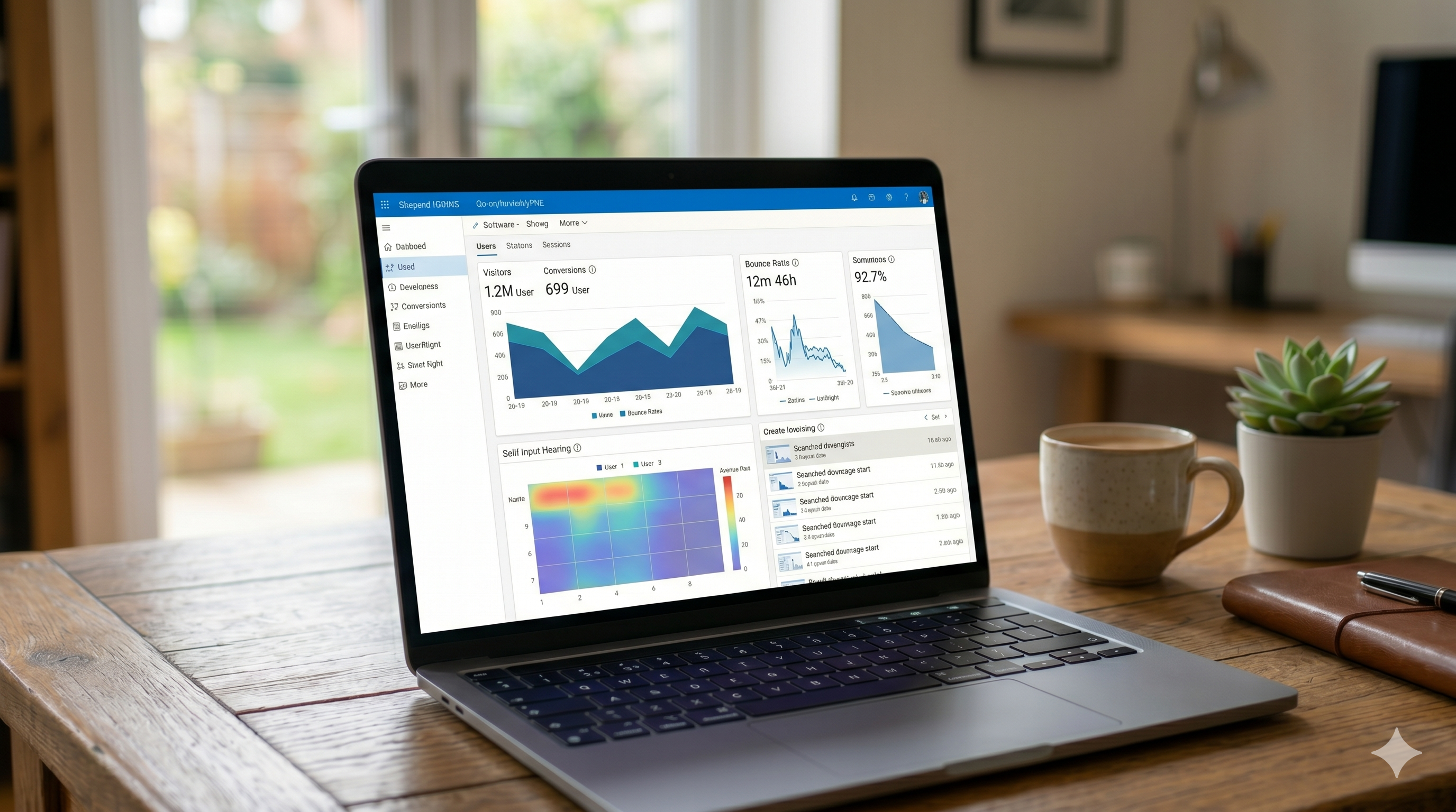
Integrating a tool like Microsoft Clarity or Hotjar allows you to look under the hood of your website’s user experience. By analyzing data on your laptop screen, you can uncover invaluable insights:
- Heatmaps: See exactly how far down the page users are scrolling and what elements they are interacting with. If visitors are ignoring your primary CTA but clicking heavily on an unlinked image, you need to adjust your design layout.
- Session Recordings: Watch live, anonymous playbacks of real users navigating your homepage. This lets you spot “rage clicks” (where a user repeatedly clicks a broken link) or moments of confusion where a visitor stalls out completely.
Using these concrete insights ensures your homepage optimisation strategy is driven by actual user behavior, not subjective opinions.
6. Optimize for Mobile-First Responsiveness
It is a well-established reality that over half of global web traffic originates from mobile devices. Yet, many teams still design, review, and approve homepages exclusively on 27-inch desktop monitors.
A homepage that looks beautiful on desktop can easily become an unnavigable nightmare on a smartphone—text becomes microscopic, buttons overlap, and images take ages to load. Always test your homepage across various mobile screen sizes. Ensure buttons are large enough to be easily tapped with a thumb, text is highly legible, and any heavy desktop layouts stack elegantly into a single-column view.
7. Compress Images and Eliminate Speed Bottlenecks
A slow website is a conversion killer. If your homepage takes longer than three seconds to load, your bounce rate climbs exponentially. High-resolution images, uncompressed videos, and bloated scripts are the usual suspects behind poor loading speeds.
- Convert images to modern formats: Switch from heavy JPEGs or PNGs to next-gen formats like WebP or AVIF.
- Implement lazy loading: This technique ensures that images below the fold are only loaded as the user scrolls down to them, significantly cutting down initial page load time.
- Minify code: Clean up unnecessary characters, spaces, and comments from your HTML, CSS, and JavaScript files.
8. Speak Directly to Core Pain Points (Not Just Features)
Your visitors do not fundamentally care about your product’s underlying architecture or its list of 50 technical features. They care about themselves and how your offering solves their specific headaches.
Shift your homepage copy from feature-focused to benefit-focused.
| Feature-Focused (Weak) | Benefit-Focused (Strong) |
| Our cloud platform includes an AI-driven, automated tagging system. | Save 10 hours a week by letting our AI automatically organize your files. |
| We offer 24/7 server monitoring with 99.9% uptime. | Keep your store online and stop losing revenue to unexpected downtime. |
9. Mitigate Risk with Guarantees and Trust Badges
Every time a user considers converting, an internal battle between desire and risk takes place. “Is this a scam? Will this break? Can I get my money back if I hate it?”
You must actively de-risk the decision-making process right on the homepage. Introduce trust signals near your conversion points:
- Security Badges: Display SSL certifications or secure payment logos (Visa, Mastercard, Stripe) near signup or checkout zones.
- Risk-Reversal Copies: Explicitly state guarantees right below your CTA buttons, such as “No credit card required,” “Cancel anytime,” or “30-day money-back guarantee.”
These micro-copies act as a safety net, removing the final psychological barriers to entry.
10. Address Objections via a Strategic FAQ Section
By the time a visitor reaches the bottom of your homepage, they are either ready to take action, or they are harboring lingering doubts. Don’t let them leave to find those answers elsewhere.
An intentional, accordion-style Frequently Asked Questions (FAQ) section is an excellent tool for handling remaining objections right before the final footer CTA. Keep the questions focused on common sales barriers, pricing hesitations, implementation timelines, or compatibility concerns. Beyond helping your conversion rates, a well-structured FAQ section utilizing schema markup provides excellent SEO benefits, helping your page rank for broader search queries.
Final Thoughts: The Loop of Continuous Improvement
Successful homepage optimisation is never a one-and-done project. Consumer preferences shift, markets evolve, and what worked perfectly last year might fall flat today.
Treat your homepage as a living, breathing laboratory. Implement these 10 foundational changes, monitor your performance metrics closely, back up your theories with behavioral tracking data, and continuously run A/B tests. By systematically removing friction and amplifying value, you will turn your homepage from a passive digital brochure into a highly predictable, conversion-generating engine.